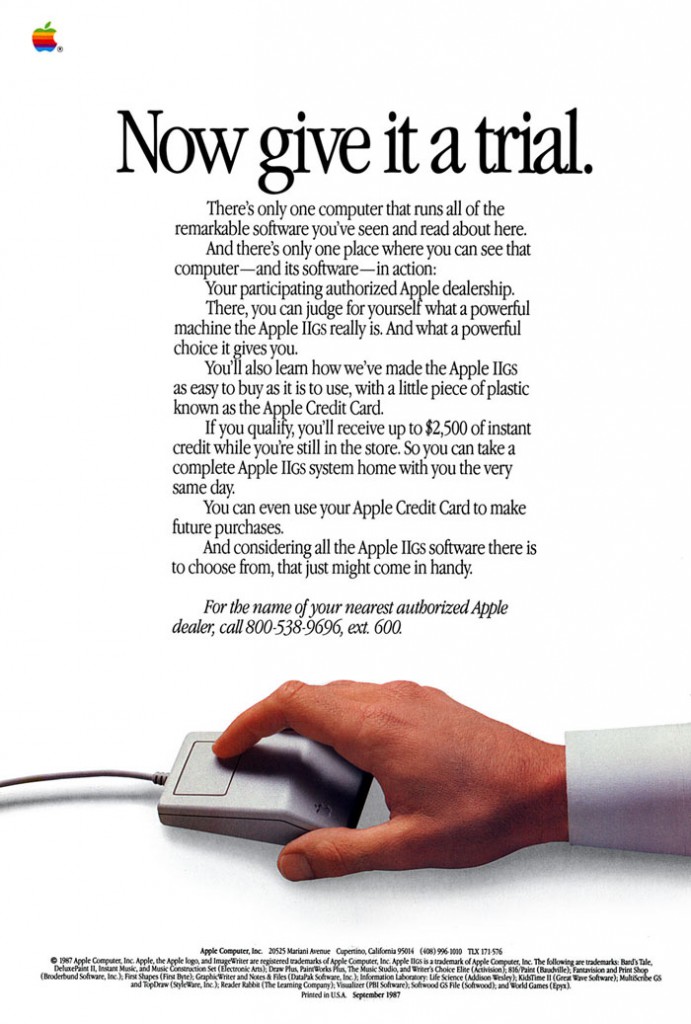
Walking though Dorchester today, I came across one of the 2010 Oakley print ads in the “Rebels” campaign, all done by a team at the-dept.com (hadn’t heard of them before – but it transpires that they seem rather cool, judging by their website that is…). One of the prints in this ad lineup looks a lot like this:

So anyway, this got me thinking—”I’ve seen this somewhere before”—and it turns out this whole ad campaign is remarkably similar to some of the old old pre-Macintosh and post-Macintosh-pre-iMac Apple ads.

Yes agreed it’s primarily the typeface (A tightly set Garamond variant, Apple Garamond in the Apple case, and I don’t know what, but it’s still pretty similar in the Oakley one), but there’s also the use of whitespace, the simple imagery and the fairly blocky justification of text (much more so with the Oakley, but then again Apple ads in this style ran for a while and I’m sure there are some more block-like variants). I liked the Apple ads of that day and age, very characteristic of the company in a very simple way, and a very different simple to that of say American Apparel and even Apple of today, but it got the point across, perhaps in a dated, but also quite wonderful style.
