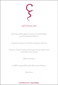
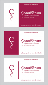
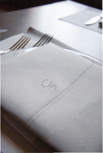
Preliminary designs for the corporate branding of a new upscale nouvelle cuisine restaurant situated in the centre of Cambridge.
Client-wise, the aim of the branding is establish Conundrum as a fresh exciting new place to eat. A simple two-tonal design was preferred by the client, but with preference for a striking colour as the primary focus. The tails on the letters, particularly the C allow for a simplistic, yet recognisable, logo and is further expanded on throughout the branding.
In designing the branding, the main focus was on the simplicity, and establishing a modern, yet funky (and in some respects young and fresh) look. Archer (H&FJ) is used as the primary typeface, with a fair few of the weights being used throughout. Its clean cut elegance resounds well for this task, giving both the menu and the business cards a modern and classy vibe.
